I realize this was suppose to be mainly white with just a little something in it, but
i did not see it that way. This is the simplest picture i could possibly take besides
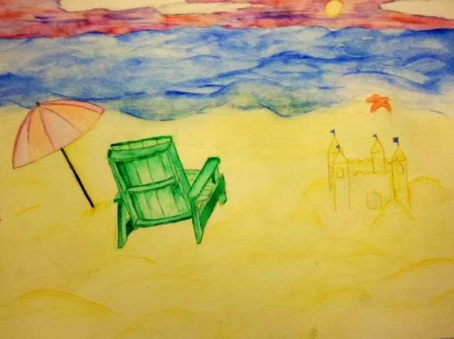
a photo of a white wall. Dont see it? I will tell you why. Note it is not a busy beach,
but rather empty. It is not stormy nor sunny nor rainy, but a mix of all three. There are
no giant waves. It is merely a blend of everything as not to be so extravagant,
over the top, to one side of anything. Its complexity makes it simple. A simple beach
you could find anywhere. Simple. Relaxed. And it took me awhile to write this so i
believe this is A+ stuff. :)
.JPG)